The Importance of Color in Screen Printing
How to Choose the Right Colors for Your Designs
When it comes to screen printing, color is like a magic wand that can make or break the success of your designs. It's like a secret language that speaks directly to the viewer's heart and can evoke all sorts of emotions - from excitement and passion to calmness, trust, and even happiness or optimism. Color is a powerful tool, my friend.

Now, let's talk about how to use this magic to your advantage. Color is the key to design. It can spark emotions, convey messages, and attract attention. It’s a language that communicates with the viewer on a subconscious level. Different colors can trigger different emotions and feelings. For example, red is the color associated with excitement and passion, blue with calmness and trust, and yellow with happiness and optimism.
But don’t take our word for it - according to a study conducted by the Pantone Color Institute, 85% of consumers surveyed cited color as the primary reason why they purchased a particular product. This underscores the importance of color in the world of merchandising and the critical role it plays in the success of a product. Understanding the importance of color and making informed choices about your color palette can help you create designs that resonate with your target audience and drive sales.
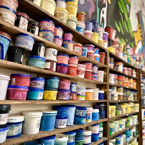
In addition to the psychological impact of color, it’s also crucial in terms of functionality. If you’re designing a logo or a piece of merchandise, you want the colors to be consistent and easy to reproduce!
So, how do you choose the right colors for your screen printing design you may ask? Here are a few things to keep in mind:
Consider your brand identity: Your color choices should reflect your brand’s personality and values. For example, if your brand is eco-friendly, you may want to use green tones to reflect your commitment to sustainability and allow your customers to subconsciously relate this practice to your business.
Think about your target audience: Who are you specifically designing for? Different age groups, genders, and cultures may respond differently to color. Consider what colors they may be drawn to.
Keep it simple: Too many colors can be overwhelming and distract from the message you’re trying to convey. Stick to a limited color palette to keep your design clean and focused. A great acronym that helps us remember is K.I.S.S., or “Keep It Simple Stupid” lol. Too many colors can be overwhelming and distract from the message you're trying to convey. Stick to a limited color palette to keep your designs clean and focused. Trust me, your viewers will thank you for it.

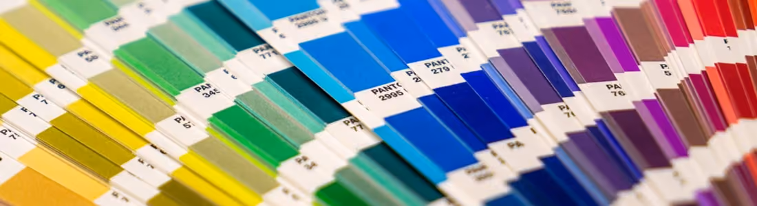
When it comes to Pantone colors, the color experts announce the Pantone Color of the Year annually, influencing many industries, including fashion, beauty, and home décor. The Color of the Year for 2023 is Viva Magenta, which the company describes as powerful and empowering. “Viva Magenta is brave, fearless, and a pulsating color whose exuberance promotes joyous and optimistic celebration.” The Pantone Color Institute releases a color palette for every season that fashion and textile designers use as a reference for their collections, this is a great thing to keep in mind if you’re stuck on this part of the process.

So, there you have it - color is an essential aspect of screen printing, and choosing the right colors can make all the difference in the effectiveness of your merchandise. By considering your brand identity, target audience, and keeping it simple stupid, you can create visually appealing, emotionally impactful designs. So go ahead and color the world! with the power of color on your side, and these tips in your back pocket, you're ready to go forth and color the world!
more blog posts

Are you ready to go renegade?