Screen Printing Guide: How to Prep Your Artwork So It Doesn't Look Like $&!@ (Updated 2026)
You finalized your design. You're hyped about the print. Then it comes back blurry, or the colors are off, or the fine lines look like they got dragged through mud. Nine times out of ten? That's a file issue — not something that happened at the press.
Screen printing is a physical process. Each color in your design gets its own stencil — called a screen — and ink gets pushed through that stencil onto the fabric. If your file isn't set up correctly, the screens don't burn correctly. And when the screens are wrong, the print is wrong. Simple as that.
Here's what you actually need to know before you submit.
Vector vs. Raster: Get This Right or Get Got
This is the most important thing on the list. Raster and vector files are completely different animals.
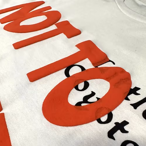
Raster files (JPG, PNG, PSD, TIFF) are built out of pixels — tiny colored squares in a grid. Zoom in far enough and you'll see them. Scale the image up beyond its original size and those pixels stretch, the edges go soft, and your clean design turns to mush.
Vector files (AI, EPS, SVG) are built from mathematical paths and shapes. No pixels. They scale to any size — from a 1-inch sticker to a 10-foot banner — without losing a single edge. Sharp is sharp, no matter what.
For screen printing, vector files win every time. Clean edges burn accurately onto screens. If your logo or design lives in Illustrator, send the original AI or EPS file. Don't export to JPG first and wonder why it prints soft.
If you only have a raster version, it can work — but now resolution becomes a the thing (keep reading).
The 300 DPI Rule — And Where People Screw It Up
DPI is dots per inch. It measures how much detail a raster image contains. 300 DPI is the minimum for screen printing — but here's the catch: it has to be 300 DPI at the actual print size.
Sending a 300 DPI file that's 2 inches wide and asking for a 12-inch print is exactly the same as just sending a low-res file. You're stretching pixels either way, and the quality tanks.
If you're working in raster, build your artwork at the actual print dimensions and 300 DPI from day one. Don't design small and upscale later hoping for the best.
Better yet — go vector and make the whole DPI conversation irrelevant.
Convert Your Text to Outlines (Or Prepare for Font Drama)
If your design has text and you submit a file with live, editable type in it, the printer's computer needs to have the exact same font installed. If it doesn't? Your carefully chosen typeface gets swapped out for whatever the system defaults to. Comic Sans has ruined more than one person's day this way.
The fix is easy: convert all text to outlines before saving your final file. In Adobe Illustrator, select the text → Type → Create Outlines. Your letters become shapes. No font needed, no substitution possible.
One caveat: once you outline text, you can't edit it anymore. Always keep a working copy with live text for future changes.
PMS Colors: Because "It Looked Right on My Screen" Is Not a Color System
Your monitor builds color with light. Screen printing inks are physical pigments mixed by hand. These are two completely different systems, and a color that looks perfect on screen can print noticeably different if nobody's managing the translation.
The most reliable solution: Pantone Matching System (PMS) colors. Pantone has standardized thousands of specific ink colors, each tied to a reference number. Specify a PMS number, and your printer mixes that exact ink — no guessing, no "close enough."
If consistent, accurate color matters for your brand, specify PMS numbers. Your printer can help with conversions if you're not sure where to start.
The Checklist (Don't Submit Without Running This)
- File format: AI, EPS, or high-res PDF (vector is always preferred). Raster at 300 DPI at actual print size if vector isn't an option.
- Text converted to outlines
- Colors called out as PMS numbers where accuracy matters
- File set up at actual print dimensions
- Separate layers for each color in multi-color designs
- No bleed — that's a paper printing thing, not an apparel thing
When in doubt, ask. A good shop will review your file before hitting print and flag problems rather than just running with a bad setup. That's what we do at Print Renegades.
FAQ
Can I submit a PNG?
Yes, with conditions. It needs to be 300 DPI at actual print size, and a transparent background is fine — better than JPG for this reason actually. But if you can send a vector file, always do that first.
What if my logo is low-res?
We can often redraw it as a clean vector from scratch. Small additional cost, big difference in print quality. Ask us.
How many colors can I use?
As many as you want — but each color is its own screen, which means its own cost. Most designs work beautifully in 1–4 colors. Spot color designs are more cost-effective than gradients or photographic images, which need halftone techniques to pull off.
PMS vs. CMYK — what's the difference for screen printing?
CMYK is for digital and full-color printing processes. Screen printing uses separately mixed spot color inks. PMS gives you a standardized number to mix against, which means accurate, repeatable color. For screen printing, PMS is the right system.
Do I need to separate my colors?
Ideally yes — each color on its own layer in your file. It makes the screen-burning process cleaner and reduces the chance of overlap errors. Your printer can handle separations, but an organized file makes everyone's life easier.
Ready to Print? Let's Look at Your File.
If you've got a design and you're not sure if it's set up right, bring it to us before you stress about it. Print Renegades works with independent artists, businesses, and brands across Los Angeles — and we'd rather catch a file issue before production than after.
Talk to us about your project → | (213) 536-5233
more blog posts
Are you ready to go renegade?